
Today kicks off our CRAFT Design Space Q+A which will take you inside the creative minds and studios of four design mavens based in San Francisco. We loved getting a glimpse behind the scenes of each person’s creative process, as well as drool over their collection of design books, tools, and knick-knacks. In this digital age, we also love the tactile so we thought it would be extra fun to have each person give us their answers on paper.
Our first stop this week is with graphic designer, educator, and writer Christopher Simmons of MINE …

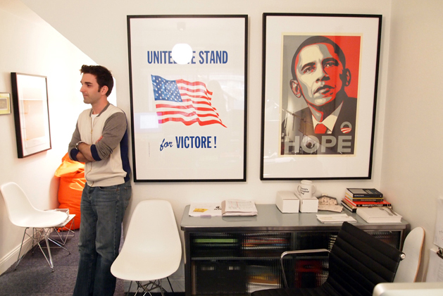
Welcome to MINE, a small independent graphic design studio nestled in the hilly backside of San Francisco’s Bernal Heights. Back in October of 2004, founder and sole proprietor, Christopher Simmons (37), converted the downstairs of his family’s new home into a meticulously organized pocket-sized office where he’s been kicking out all-star designs for the likes of the AIGA, Stanford, the California Academy of Sciences and, well, himself. Because the space is so small and so well-kept we had to get some background on how Christopher helped bring it all together:
The wall were beige and there was beige Berber carpet. First I painted, because that was easy, then I re-carpeted with FLOR. For the first six months we sat on our dining room chairs and then brought them back upstairs at the end of the day. Slowly I bought new chairs, desks, filing cabinets, replaced the lighting etc. All in all I think it took two years to reach this point, including some structural build outs that I hired out. I’m very particular about the appearance of our work environment, so I took my time to get it “right.”
In the studio foyer — just beyond a frosted glass door etched with the trademark, “this is our office™” — you are immediately greeted by two posters mounted at eye level. The first reads: F*in design; the second: Believe in things and they will believe in you. We asked Christopher to explain a little bit about some of his work and his process:
F*ing Design: Poster I designed for an AIGA event in 2004. The “F” stands for “Fear, Faith & Foolishness.” It was a three part lecture series, each on one of those 3 topics. I also came up with the idea and name for the event and organized it. The typefaces are AIGA’s official typefaces (Filiosfia and Interstate), but we reversed their usage (Serif for text, sans serif for display).
Believe in things and they will believe in you: My former designer printed this on a grid of his old business cards and gave it to me as a parting gift. Neither of us remember where the quote came from, but its sage advice.
Everything is OK: Everything is OK is a public design experiment that creates additional layers of meaning once it is deployed: The yellow caution tape with the phrase “everything is ok” becomes an interactive caption that modifies spaces, events, objects and traffic. The tape is distributed to participants via the web site (www.everythingisok.com). People then make use of the tape as they wish, deploying it in public spaces as a form of guerilla design or activism
World’s greatest/second greatest mugs: Just a fun product we initiated ourselves. I think all those World’s greatest dad/grandma/etc. shirts and mugs are kind of hilarious self-proclamations. I figured, what if the object itself proclaimed its greatness? Would it make it true? What would the other mugs think? As a bit of an inside joke, the “Greatest” mug is typeset in Helvetica. The “Second Greatest” is in Arial. More here.
Christopher’s work has been exhibited at the Pasadena Museum of California Art, The Museum of Contemporary Art in Hiroshima, Japan, The Museum of Craft & Design, San Francisco, The Smithsonian Institution, and is part of the permanent design archives of the Denver Art Museum.
ADVERTISEMENT


