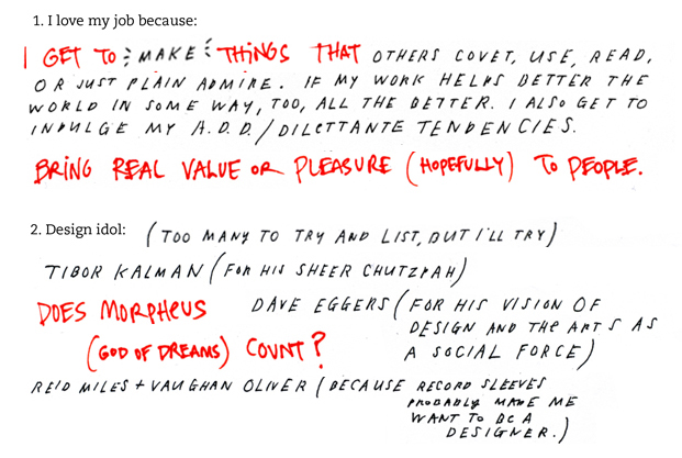

Wrapping up this month’s Design Studio tour we have the independently minded design company, Volume Inc., comprised of Adam Brodsley and Eric Heiman. Eric and Adam met while teaching at San Francisco’s California College of the Arts. They founded Volume “at the dawn of the new millennium” and the rest is history. Living history, that is …

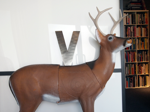
Volume is located in an unassuming building off the beaten track in San Francisco’s Mission district. Open the door and you’ll be greeted by the unofficial office mascot, The Deer.
The Volume deer is a prop from one of our very first jobs. It’s normally used as a practice target for bow and arrow hunters, I think. We created a temporary holiday exhibit for Microsoft using a few of them as reindeer, and the client let us have one afterward. He doesn’t have a name — simply, “the deer” — but has been with us since the very beginning. Our oldest, most steady employee.
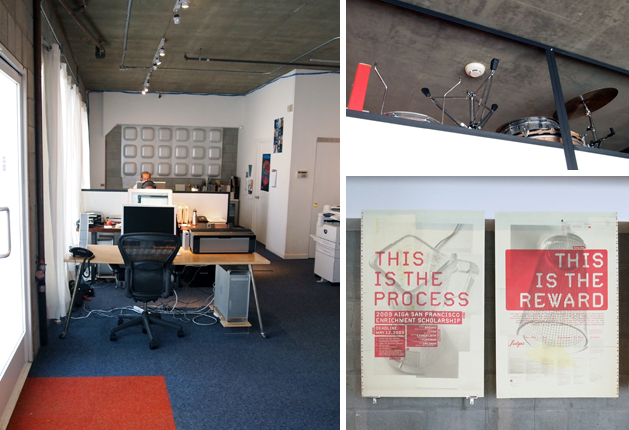
The office is small but expertly set up with 6 potential work stations, a separate meeting area, and plenty of eye candy. I also noticed a small drum kit stashed up high and had to inquire with Eric:
I’ve had the Ludwig champagne sparkle 4-piece drum kit since I was about 13 or 14. The drums are from the 1960s and my father found them used in a music store. One of the few possessions that made the 3,000 mile move to California with me. I’ve never been in a steady band (at least since college) but I’ve always held onto the kit, and I still set it up in the studio once a month or so. It’s an ideal stress release. I dream of having a big enough studio so I can keep them set up all the time, maybe even start a band of middle-aged designers doing bad punk rock covers. I’m not so sure the rest of the office shares this dream, though.
—–>>>> Pssst. You can take Pentagram’s “What Type Are You?” quiz here.
Adam’s gentle giant Rhodesian ridgeback, Zulu, has also been around since the company’s advent, and he works hard to be a contributing member of the team:
He can clear out the office if he’s having a rather flatulent day. Every so often he’ll do some photo research for us, too.
I thought of asking the guys about the fabulous (donkey?) piñata chillin’ in the storage area, but decided he was better left a mystery. And I will not even go into how badly I covet the Volume library. Le sigh.
Volume has created work for a number of San Francisco staples, including the California Academy of Sciences, the San Francisco Museum of Modern Art, Yerba Buena Center for the Arts, Flora Grubb, Southern Exposure, Heath Ceramics, Chronicle Books, and McSweeney’s. Other notable projects include the ReadyMade book, as well as some covers for our very own O’Reilly Media. Eric was kind enough to share some insight behind a few recent projects (above):
Yerba Buena Center for the Arts summer campaign
YBCA is still the most cutting-edge of all the major arts organizations in the Bay Area, and this campaign set out to remind people of this fact. YBCA unapologetically promotes uncompromising, polarizing art and, love it or hate it, this solution doesn’t play it safe. Even we had reservations in the days before the campaign was to hit the streets. In hindsight, though, the work really does capture the subversive, fun spirit of YBCA and really separates them from all the other arts organizations whose promotion tends towards the stately and remote.
SF Sound poster
We created this with the writer, Reyhan Harmanci, for the McSweeney’s Panorama newspaper one-off, and then did a deluxe reprinting on archival paper. (We’re also still giving away free signed copies here. Just send us a thank you note.) We knew the poster’s micro level would be no problem to pull off. The real challenge was to express the rock music theme on the macro level. We like to think of it as an “info-speaker” with the volume turned up to 11.
Mohawk Solutions Promotion
In the spirit of how we as designers always entertain different “solutions” for a single problem, we gave the same image sequence to three different writers who turned in three very different interpretations — a prose story, a short monologue, and a six-word memoir — to create the promo’s three “stories.” (Mohawk was combining 3 existing paper lines to create the new Solutions line.) Each story’s image sequence is identical in scale and pacing, but differ in paper stock, color and typography to express the themes of the writing. It’s the “Run Lola Run” or “Groundhog Day” of paper promos–it always starts with the same assets, but the three outcomes are very different.
Volume is also responsible for the brand new ScholarMatch website, created for Dave Eggers and 826 National to help local, in-need students pay for college. You can listen to the Juy 28, 2010 Forum discussion with Eggers and Miel Alegre here.
Eric Heiman is a graphic design instructor at California College of the Arts (CCA), and a columnist for SFMOMA’s culture blog, Open Space. Adam Brodsley is currently writing a bio for this space while hocking SF Sound posters at the corner of 17th and Harrison. You can read another Q+A with the dynamic duo in conversation with John Bielenberg at STEP (2005).
ADVERTISEMENT


