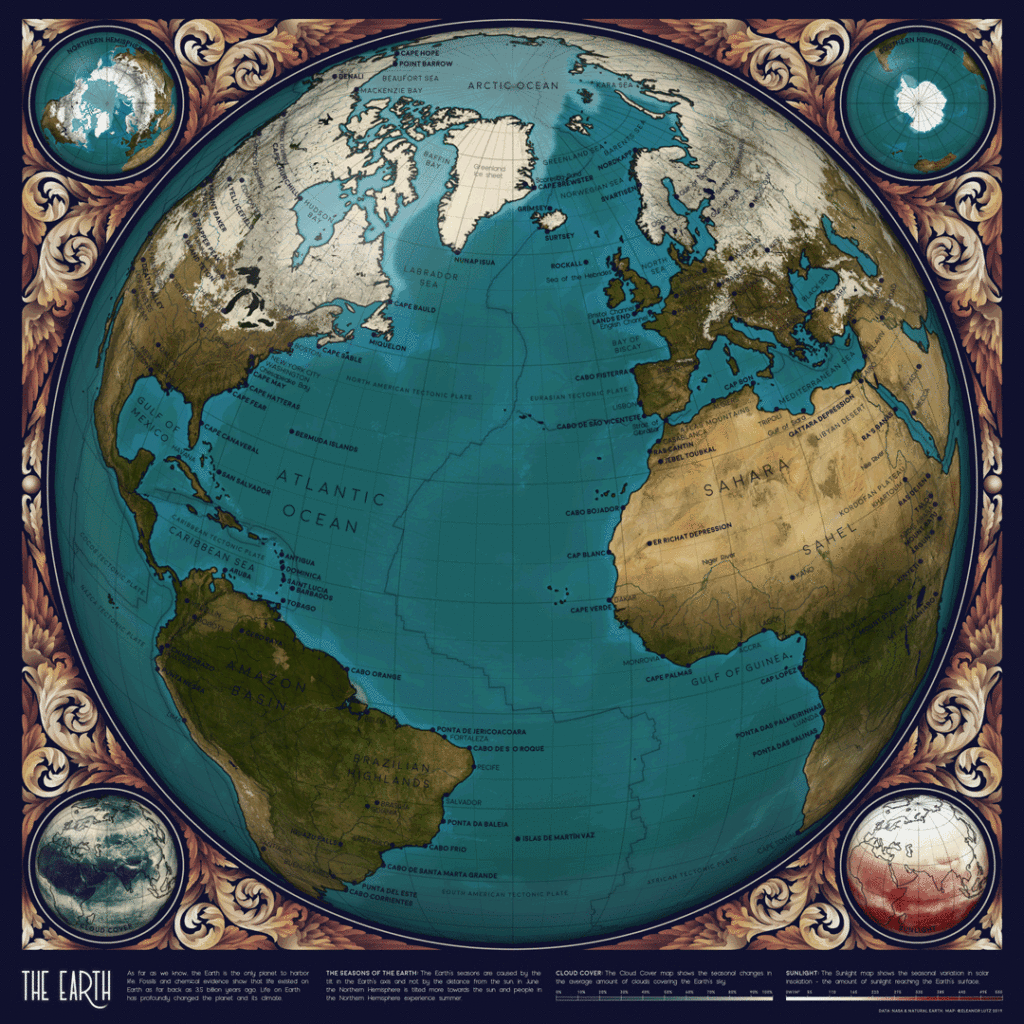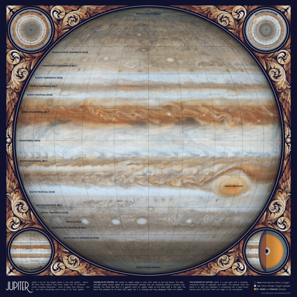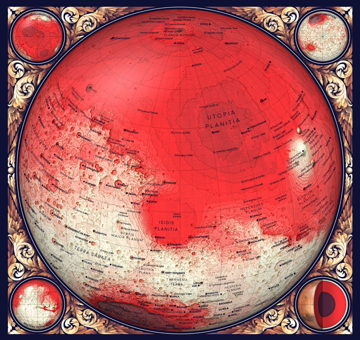
For two years I’ve been working on a collection of ten maps of planets, moons, and outer space. To name a few, I’ve made an animated map of the seasons on Earth, a map of Mars geology, and a map of everything in the solar system bigger than 10km. I call it my Atlas of Space.
Last summer I began sharing each map, along with the open-source Python code and detailed tutorials for re-creating the design. All of the astronomy data comes from publicly available sources like NASA, USGS, and the International Astronomical Union (IAU), so I thought this would be the perfect project for writing design tutorials (which I’ve been meaning to do for a while). The finished tutorials now cover:
- Working with Digital Elevation Models (DEMs) in Bash and Python
- Working with ESRI shapefiles in Python
- Using the NASA HORIZONS orbital mechanics server and scraping internet data
- Working with NASA image data
- Combining many datasets into one map
- Color palettes and style design
- Decorative illustrations and painting in Photoshop
- Plotting with symbols and different languages in Matplotlib
- Editing Python outputs in Illustrator
- Using the IAU Gazetteer of Planetary Nomenclature
- Map projections in Python Cartopy
- Mapping constellations using star catalog data.
I originally learned Python for my grad school research, which involved processing video recordings of mosquito behavior. I really liked the language, and now I use Python extensively for data management and graphic design. I also love teaching Python — I volunteer for Software Carpentry, and I taught Data Science for Biologists at UW last year with Bing Brunton and Kam Harris.
So if you’re interested in beginner-friendly explanations of Python cartography, web scraping, or using the NASA orbital mechanics server, this is the project for you.
Software used includes Python 3.7.1, GDAL 2.4.1, NASA HORIZONS, Adobe Illustrator and Photoshop. Python dependencies include matplotlib, numpy, pandas, os, cartopy, json, osgeo, math, scipy, and jupyter.
Each of the following tutorials includes special instructions for beginners, graphic design advice, and all of my open source code, ready to run. Find them at at github.com/eleanorlutz?tab=repositories. You can do this.
Tools
- Computer running Python 3.7.1 and GDAL 2.4.1 Both are free and open source.
- Image editing software, raster and vector I used Adobe Photoshop CC 2019 and Illustrator CC 2019, but you can also use the free open source programs Gimp and Inkscape.
Solar System Orbital Map

This tutorial shows how to map the orbits of all the planets and more than 18,000 asteroids. This includes everything we know of that’s over 10km in diameter — about 10,000 asteroids — plus 8,000 randomized ’roids of unknown size. I used the NASA JPL Small-Body Database Search Engine to make a list of all known asteroids and comets in the solar system, and pulled the planets, moons, and trans-Neptunian objects from other NASA datasets. All this data is public but it’s in several different databases so I had to do a decent amount of data cleaning. The map shows each asteroid at its exact position on New Year’s Eve 1999.
Topographic Maps of the Moon and Planets


This shows how to make topo maps of planets and moons using open-source data from the USGS, IAU, and NASA. I wanted to map each of the rocky planets in the same style: Mercury, Mars, Venus, and the Moon. To begin, I used GDAL to convert the DEM files to orthographic projection, then downsampled these and created hillshade and slope maps for each hemisphere. Next, I made five Python plots with the contour fills, contour lines, text labels, and two types of gridlines (Figure A). Finally, I used matplotlib gridspec so that each of my subplots occupy the exact pixel locations inside my decorative border.
I also designed a cutaway diagram showing the interior layers of each planet. These were tricky because some layers were so thin that they were virtually invisible. To show even the thinnest layers, I designed an adjusted diagram where every layer has a minimum visible thickness.
This project was heavier on the illustration side than my asteroid map. I had a lot of fun designing the scrollwork, and I also designed Photoshop overlays to add a 3D effect to the globes and the cutout core diagrams.
Geologic Maps of the Moon and Mars

For this I used open-source data from the USGS, IAU, and NASA, but I added more topographic and label data, redesigned the visual style. The Mars map (Figure B) is an artistic rendition of the USGS map. I also edited the key for a more general audience. For example, my abbreviated definition for a caldera rim is, The rim of an empty magma chamber left behind after a volcanic eruption. The original description was, Ovoid scarp, outlines single or multiple coalesced partial to fully enclosed depression(s); volcanic collapse, related to effusive and possibly explosive eruptions. Right!
I wanted to accurately show how much of the planet was made up of each geologic formation, so I decided to use an Eckert IV equal-area projection. This type of map distorts object outlines, but it preserves the relative area of shapes across the globe. Eckert IV is not great for visualizing the polar regions, so I added four inset maps to the corners to show each hemisphere of Mars.

The Moon map (Figure C) was much more difficult. The geologic data was split into six different datasets, each with unique labels and some with different data formats. Where geologic categories were described differently, like “Basin Material, Rugged” vs. “Material of Rugged Basin Terrain,” I combined closely related terms into a single color. Also, the geologic timescales weren’t precise, so I decided to omit timescale data. The map features are colored by geologic category (craters, basins, etc.) and not by age.
Animated Earth

This uses open-source code and data from NASA, USGS, and Natural Earth. NASA publishes many beautiful Earth datasets at monthly time scales, and this GIF uses one frame per month to show the fluctuating seasons, focused mainly on data about vegetation and Arctic sea ice (Figure D).
Animated Jupiter

Just for fun, this animated GIF illustrates the storms on Jupiter (Figure E). Created mostly in Photoshop, based on photos and video published from the Cassini spacecraft in 2000 and 2006.
The Night Sky

Western constellations — Shows every star visible from Earth, plus the brightest galaxies, nebulae, and star clusters from W.H. Finlay’s Concise Catalog of Deep-sky Objects. I illustrated the familiar Western star patterns — or asterisms — in blue and gold, and the scientific constellation boundaries in red (Figure F), using open-source data from Stellarium and the HYG Database.

World constellations — Includes the animals, people, and objects imagined in the sky by more than 30 civilizations including ancient Egyptian, Arabic, Korean, Chinese, Japanese, Dakota, Hawaiian, and Mongolian cultures (Figure G).
DIY Map Design
All of these tutorials include sections on how to design your maps in Python, Illustrator, and Photoshop. I’ve also shared a piece of the scrollwork illustration file that includes the original layers as reference, if you want to use a similar style in your own projects.
I love working with astronomy data. I’m sure I’ll make more maps in the future, but I had to take a break to finish my last PhD research project and my current fellowship at The New York Times.
Get These Maps
This project appeared in Make: Vol. 74. Subscribe today for more great projects delivered directly to your mailbox.


