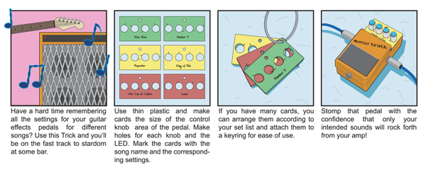
San Francisco-based illustrator, graphic designer, and tinkerer Tim Lillis has contributed a number of great illustrations, technical and otherwise, to the pages of MAKE over the years. His enthusiasm for making and data visualization comes through in his clean, clear designs. Tim also spearheaded the Tricks of the Trade mini how-to series that appeared in a number of Volumes in the Toolbox section. His latest venture, Music Video Race, creatively pairs musicians with filmmakers.
One project you’re particularly proud of:
1. I’m very proud of co-founding Music Video Race, which is essentially a platform for musicians and filmmakers to collaborate and do it themselves. We pair up 20 bands and 20 teams of filmmakers to make music videos in one weekend, and then the next weekend we do a big screening/awards party.
We just had our second annual event a few weeks ago and it went amazingly well. The amount of talent on display was just insane. I couldn’t believe how much magic we packed into the Rickshaw Stop for the screening. I was truly humbled by the vibe in that room, the community, the people, the talent, everything.
It would not have happened without my co-founder Jacquelyn Marker, who’d been on the producing team at Mythbusters for years, and is just generally awesome, smart, tireless, and great to work with.
Since we started the event, filmmakers and musicians who weren’t even paired up in the event have gotten together to make other videos, filmmakers who have been looking to break into videos have had lots of calls from bands to work together, and a series of filmmaker meetups and screenings have grown alongside the event, organized by participants who met through Music Video Race.

Two past mistakes you’ve learned the most from:
1. When I was a kid, I had some ideas for some new Transformers. Partly inspired by the video game Spy Hunter, and by Transformers in general, I set out to plan for their creation. I was roughly familiar with the concept of blueprints, so I created some for the robots. Being 10 years old though, I didn’t really know what blueprints were.
So I drew the plans up on blue construction paper (blueprints, duh) and somehow found an address for Hasbro (pre-internet — whaaaaat!?). I packed them all up and sent them along. I still haven’t heard back, but I’m sure they’ll contact me soon. And just to clear up any possible misconceptions, the Mountain Dew robot from the first Michael Bay Transformers movie bears no resemblance to my designs, except that it is also COMPLETELY RADICAL, DUDE.
The thing about these drawings is that I don’t have them anymore. So the lesson I learned is that documentation is really important. I learned that in college, and then on every project since then. I’m still learning to document better and more efficiently. Once you start to put together and edit your documentation for sharing, archiving, or whatever, that’s when you really learn what you need, or what shot you should have gotten. And that’s what makes you better at doing it next time. So my advice is put together a slideshow, tutorial, video, or other format presentation every time you document something, regardless of whether or not you’ll share it with others, and that will help you be a better documenter of your own work.
2. This isn’t one mistake per se, but for a while I was afraid to “go for it.” That got old when I realized I wasn’t doing the things I wanted to be doing, whether personally or professionally. I now know not to wait until I’m fully prepared to do a thing. Phillip Torrone has a great post here on Makezine about this that breaks it down very well, highlighting especially well how fun it is to learn new skills. I owe all the illustration work that I’ve done for MAKE and CRAFT (and because of that, work for Google and others) to a blind email I sent to the magazine after seeing the first issue. I was earnest and interested, and had skills, but no one would have known about any of that had I not just reached out. Do not wait for things to happen to you — happen to them.
Tim’s illustration for the Roomba Hacks article from MAKE Volume 10.
Three books you think every maker should read:
1. Maybe this an easy answer, but I just read Chris Anderson’s Makers and I do think every maker should read it. Especially young makers, who might not remember a time before things like the internet and smartphones (I think we just call them “phones” now). It highlights that we are really in a unique time, and I feel it’s very inspiring for those who are on the cusp of becoming makers, showing how low the barrier to entry really is.
2. The book Tibor Kalman, Perverse Optimist, about graphic design legend Tibor Kalman and his firm M&Co, is fantastic and inspiring. It shows what one person, working with a talented network of people, can accomplish. There are some great “fake it until you make it” anecdotes, and there’s a memorable essay by David Byrne called “The Holy Grail of No Style” in which he urges the creative pursuit of taking on each task in a dynamic way, while attempting to remove oneself and letting the solution emerge.
3. Your old sketchbooks. There should be way more ideas in them than you can remember. Aside from just serving as external memory, they’re great for combatting creative block (maker’s block?), reminding you that yes, you do have ideas. And if there’s no one else around to collaborate with, reading them is like collaborating with your past self.
Four tools you can’t live without:
1. My computer running Illustrator — is that two? Rules are for squares.
2. Pen and paper — I did it again!
3. Other people. People aren’t tools, but they are resources, partners, collaborators.
4. Is a bike a tool? It’s how I get everywhere, and it’s a great place to think.

Five people/things that have inspired your work:
1. Tim Hawkinson. He’s an artist that I’ve seen exhibited a few times, first in a giant warehouse at Mass MoCa, where he made a seriously huge air bladder thing called the Uberorgan. It’s a reed instrument, anatomical model, junk pile, and player piano all in one, and it’s fantastic. I then saw his retrospective at the Whitney in N.Y., which was equally impressive. He has a way of turning everyday materials into something truly remarkable. The resourcefulness is amazing to me.
2. Airplane emergency diagrams. Infographics are quite popular these days, but the first place I remember really being struck by how illustration and design can convey information in an exciting way was looking at these. Maybe it’s just that the subject matter was exciting, but they stuck with me.
3. Improv. I do like comedic improv. But more generally, I like when people (or animals) attempt something that they are not officially prepared for or don’t have the “right” tools for. Looking at people’s kludges is a) sometimes hilarious and b) inspiring because it shows that there is always another way to do something. Seeing this stuff in action is even better though, as on a film set, when new challenges are always popping up, and new solutions are always required. Some of the less elegant ones are included here.
4. Music. I’m always listening to music while I work, and I don’t discriminate, though I do curate. I’ve found that I can reinforce my mood, excitement about a project, momentum, etc. by picking music that’s in line with it. If a phase of a project requires some analytical thought, I’ll pick something mellow — Tristeza or CocoRosie come to mind. If it’s more about production and getting it done, I’m more interested in creating a mood or environment that allows me to put my head down and draw/edit/whatnot. I might play something more upbeat and rocking. Cloud Nothings and The Mae Shi have been recent faves.
The connection between visual art and music is certainly well-established. I was recently inspired by an essay by composer John Cage (who himself was inspired by visual things, including Rauschenberg’s White paintings, for his silent piece 4’33”) to create a drawing series where I interpreted Cage’s phrases in a style of graphic notation that is theoretically playable.
5. My friends. I’m constantly amazed and inspired by the projects they put together.
Tim’s diagram that accompanied the $5 Heli-Rocket project from MAKE Volume 25.
ADVERTISEMENT


