This article appeared in Make: Vol. 90. Subscribe for more maker projects and articles!

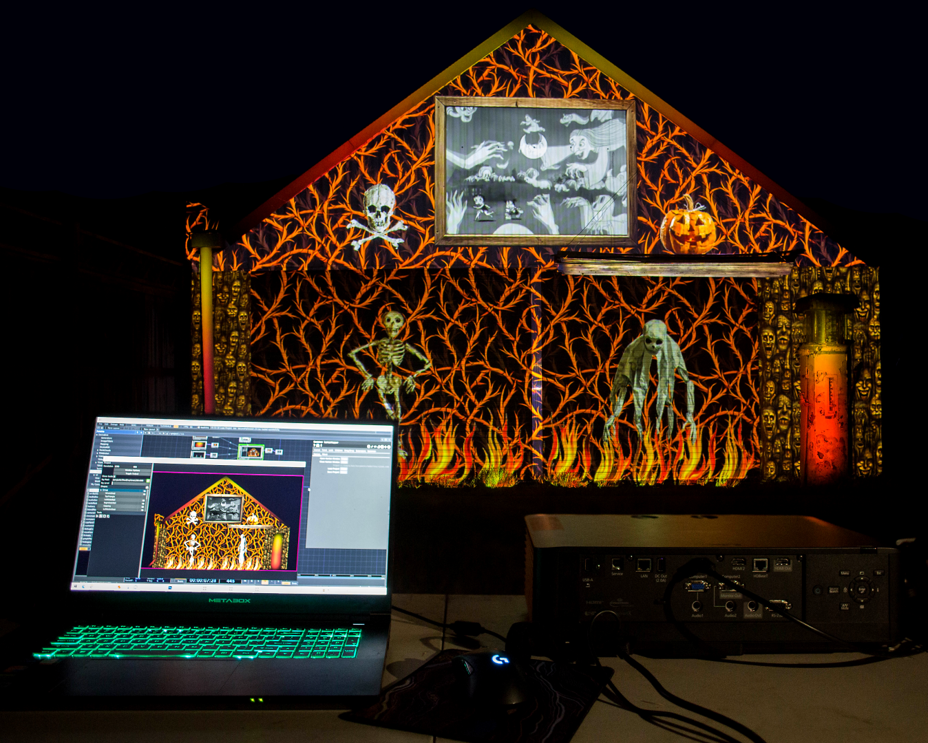
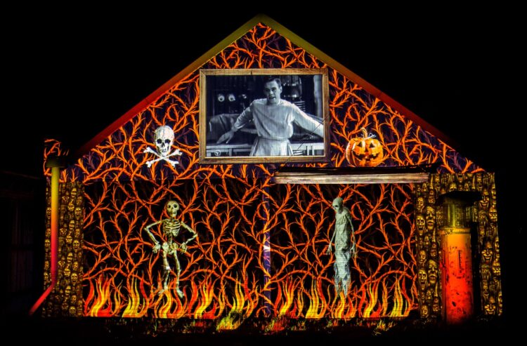
Want to be the envy of your neighbors next Halloween? If you have access to a projector, and a laptop with a GPU and sufficient specs, you can create a spooky display that’s sure to impress all your candy-seeking visitors — and it won’t cost you a cent.

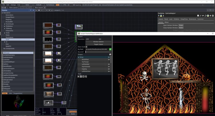
The final result, certain to draw a crowd

Our small team at VJzoo have been projecting since 2003 and can help you to make the most out of whatever projector you can get ahold of. We used to do a lot of street projection with quite small projectors, so we’ve got tips and tricks to help you accomplish an effective display on a minimal budget. For starters:

  • Simple, bold content — Big, bright designs will show up best. Subtle work, like photography and detailed illustration, can be lost on a wall unless it’s a very plain, single-colored wall.
  • Black background — Break up the edge of your frame with an irregular black background to get away from the usual 4:3 or 16:9 rectangular shape. This makes it seem less like “shoddy screen” and more like “content interacting with wall surface.” Black does not project, so black areas will be the color of the wall. Avoid white backgrounds, as they will just light the surface of your building.
  • “Inverted silhouette” content shows up very well, even with quite a bit of ambient light.
  • DLP projectors are more suitable than LCD — more bang for your buck, higher contrast, brighter colors, and you won’t really notice the DLP’s “rainbow effect” like you do on a screen. Laser projectors are even higher contrast, if you have access to one. But basically, use what you can get.
  • Avoid ambient light — Try to get nearby lights turned off, or mask them with foil. Peripheral light is your biggest obstacle.
  • Play safe — Don’t play fast-moving or otherwise distracting content near traffic.
  • Clean power — Mains power is best if you can get it. That’s always our first choice. If you need to use a generator, make sure it’s a “sine wave” generator, or else use a sine wave inverter with a normal generator, deep-cycle battery, or car battery (with the car running). Hot/spiked power or low/browned-out power can destroy a projector instantly.
  • Test, test, test — The only way you can really tell how projection will look on a particular wall is to try it. Especially on surfaces like windows, it’s difficult to predict what will show up. So give it a go!

For this introductory project, you’ll be doing 2D mapping and masking, to project still and moving images. This is the standard for a lot of large-scale building projection mapping. After you master these skills, you can step up to true 3D mapping, where you create the content to suit a 3D model of the target with the projector as a virtual camera.

What will the next generation of Make: look like? We’re inviting you to shape the future by investing in Make:. By becoming an investor, you help decide what’s next. The future of Make: is in your hands. Learn More.

Project Steps

1. Test your projector coverage

We often get asked, “How many lumens (lm) will I need?” Really the answer is, get the brightest projector you can afford — but go ahead and test whatever you can get. We have often been able to use a 4000lm projector outside despite significant ambient light, as we’ve made content especially for outdoor projection.

Projector Central has online calculators that can help you work out which projector will work in what space, and how large your projection will be at the distance you need to place the projector back from your target surface. Admittedly, we’re usually projecting much larger than the recommended maximum size in the specs, but most projectors will still focus. (The exception to this is ultra-short-throw projectors like those used in classrooms, which sometimes have a fixed focal distance and therefore a maximum size they can project. Probably best avoided for our purposes.)

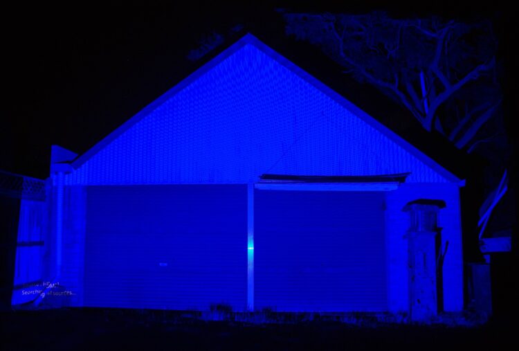
Alternatively, you could just turn on whatever projector you’ve managed to get and point it at your garage or wall to have an idea of the coverage you’ll be able to get from the distance you’re limited to. Most projectors will be set to project just blue without a signal (Figure A), but you could cable it to your laptop and set a test pattern or solid color as your desktop, and then extend your display to an external monitor (not mirroring/duplicating it). We’ll assume you know how to do this!

Figure A

This is a good stage to also scope out ambient light, and whether there’s anything you can do to reduce it. If you can’t turn off a light that’s falling on your target surface, perhaps you can remove the lamp, or mask it in the direction of your surface with foil or something else that isn’t flammable. This isn’t as necessary if you have a big, powerful projector, but if it’s just a home theater or boardroom one, then anything you can do to reduce the ambient light is worth doing.

This test will also show you which of your surfaces will hold projection. For example, if you have windows, you might need to put up cardboard or curtains to hold the image. Bright surfaces are much more effective than dark surfaces, so this will help you plan where to put your content.

2. Photograph the building

2a.

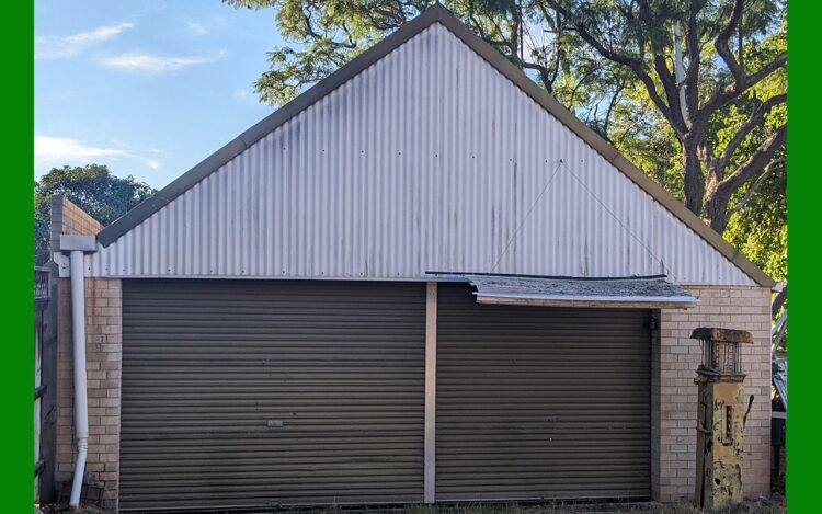
Take a photo of the building in the daytime from approximately where your projector will be located. Frame it to include all of the building you could cover at your projector test. Back in the day, this needed to be done very accurately with a lens that matched that of the projector. Happily, these days, it’s easy to adjust your mapping digitally on the fly — so this photo is really just to design your display and understand what shapes you’ll want to create (or source) your content in.

2b.

Crop your photo to the maximum coverage of your projector (from your test), then resize it to 1280 pixels wide. Now “pad” it to be the same aspect ratio as your projector (usually 16:9 or 16:10, or if you’re using an older projector it might be 4:3). In Figure B, the green portion shows where we padded extra space on the sides so the final image is 1280×800 pixels (16:10 ratio).

Figure B

3. Set up the software

Download and install the non-commercial version of TouchDesigner from derivative.ca. This will allow a maximum canvas size of 1280×1280 pixels. This means that if your projector is higher resolution than 1280 pixels wide, your content will be upscaling, so it won’t look as good as if you were using the commercial version of TD — or something like Resolume Arena or MadMapper — but it’s pretty good as a no-cost option! It also has integrations to Ableton, Adobe Illustrator, Kinect, and other platforms that are fun to play with.

Resolume Arena and MadMapper are both easier to use and have a free trial — but they both brand the image output in their free-trial versions, so we’ve gone with TouchDesigner so your Halloween display won’t be interrupted by branding.

4. Make your slices in TD

Using your photo and coverage test as a guide, you will create each “slice” of your surface that you want to be able to individually put content in.

4a.

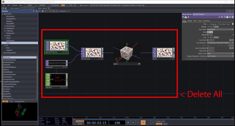
Delete all the demonstration starter nodes (Figure C), or start a blank project with File New. Save your project with a new name.

Figure C

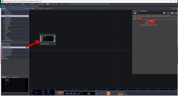
In the Palette menu, click Mapping and then drag Kantan Mapper onto the central workspace, called the network. TD often has really useful help documentation, which is the case for Kantan Mapper. Click on About → Pulse to open a detailed step-by-step of how to use this component (Figure D).

Figure D

Leave that resource open while we demonstrate how to use those tools to map our garage and create a Halloween display.

4b.

Connect to your projector, then adjust your computer’s OS settings to extend your screen output to the projector. Use “extend” rather than “duplicate” or “mirror” options.

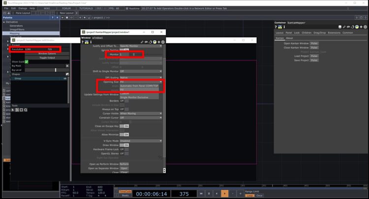
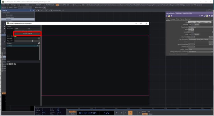
In Kantan Mapper, assign the projector as your output and set the projector resolution (Figure E). Usually your main screen is 0 and your projector or second screen is 1, so choose 1 in these settings. When you hit Toggle Output, if your main screen goes black the monitor number is most likely incorrect — just Alt-Tab (or Command-~ on a Mac) to get back to the Kantan window to toggle it off and try the window options again (Figure F).

Figure E


Figure F

If the native resolution of your projector is higher than our limit of 1280 pixels wide, calculate the closest corresponding resolution with the same aspect ratio. For example, for a 16:9 ratio, use 1280×720 (720p) for 1920×1080 (FHD); for a 16:10 ratio, use 1280×800 (WXGA) for 1920×1200 (WUXGA).

4c.

Drag your resized photo into the network workspace. Position it high enough that you can still see it when you toggle the Kantan Mapper window back on.

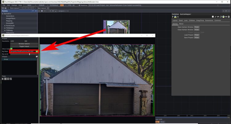
Drag your background image from the network workspace to the Bg Mask field of the Kantan Mapper window, and check the box next to it by clicking the X (Figure G). Your background image will now appear at the default of 75% opacity.

Figure G

Now you’ll trace out all your shapes or slices — see the Kantan Mapper Help for detailed instructions for doing this. Name each shape as you draw it, and don’t forget to save your project (.toe) file and mapping (.json) file regularly as you go. These are both very small files, so keep a number of iterations back. TD will save a project every time as a new file by default.

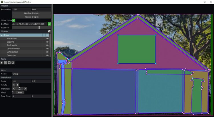
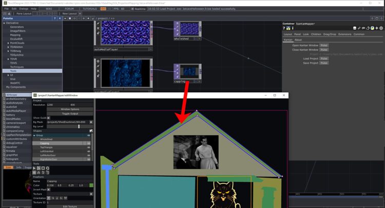
We’ve used the freeform tool here, and have created a slice for each area that we want to be able to fill separately, as well as a slice for the whole building so we can add a cohesive background pattern if we want to (Figure H).

Figure H

The eye icon next to each layer toggles the visibility of the slice on and off. One thing worth noting is that the lower the layer in the list, the further “in front” that slice is, unlike Photoshop, Illustrator, and many other programs. In our example project file you’ll see that the downpipe, awning, and gas pump slices are lower down the list than the building pieces behind them.

We’ve organized all our slices in one group, but if your building is more complex you might wish to use multiple groups to keep track of your slices.

4d.

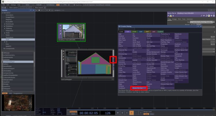
Now you’ll export your map so you can use it as a template in your content-making workflow. Double-click in a blank area of the network space and select TOP Movie File Out (Figure I ).

Figure I

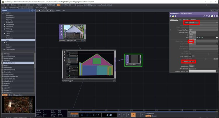
Then change the Movie Out settings: set Type to Image, and set Movie Pixel Format to PNG to maintain transparency (Figure J).

Figure J

Now select one slice at a time and export each to an individual PNG. Make sure to rename the file each time to the name of your slice, or it will overwrite the previous one. To save the PNG, toggle Record to On then back to Off.

To get the Kantan Window up at any point to access your slices, click on it in the network workspace then hit Pulse next to Open Kantan Window.

4e.

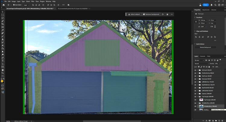
Once you’ve saved all your slices as PNGs, you can paste them all into a layered Photoshop file so you can work on your content as a whole composition. Work out the dimensions of each slice, round up to the nearest 20 pixels or so to allow for tweaking later, then type those dimensions, as well as the slice name, into the layer, as you will need this info later. For example, TopTriangle 1200×400 is one of our slices.

If you’re using Photoshop to collect and size your content, you could make each slice a layer folder and put content into each so you can easily turn the slices on and off, or change the opacity to see underneath a slice.

If you have something you want to mask off such as a reflective window, you can make a slice and fill it with black, as black does not project.

Now paste your building photo underneath so you can see each surface (Figure K).

Figure K

5. Create or source your content

Now that you know the sizes and shapes of your slices, you’ll need content for each of those slices. While you can stretch content to fit any shape, it looks best if you keep the original aspect ratio, so keep that in mind when creating/sourcing your content.

TIP: If you’re using AI to make content, prompts such as “high contrast illustration, simple, bold, black background” will show up best, especially if you have an underpowered projector. Some AI programs will even let you specify aspect ratios; for example, for the skeletons we made in Midjourney for this project, we specified a 1:3 ratio to fit on the upright of the garage. Some can also create repeating patterns, which make good backgrounds.

You can also create or source still images, animated GIFs, or video animations from 2D or 3D programs. A wide range of formats are accepted by TouchDesigner. TD also supports alpha (transparency) as long as your file format also supports that.

We absolutely love old films, and a lot of old black-and-white horror films are now public domain. You can download full movies from archive.org and edit your favorite scenes, or just play the whole movie. These are generally 4:3 ratio, so having a slice somewhere on your building that’s 4:3 would really suit these old movies. Some of our suggestions for Halloween are: The Cabinet of Dr. Caligari (1919), Haxan (1922), Nosferatu (1922), Dracula (1931), Frankenstein (1931), Bride of Frankenstein (1935) and Betty Boop Minnie the Moocher (1932). You can edit scenes from these for free in DaVinci Resolve. They don’t need to be any higher resolution than the slice on your map, so if you edit to that size then your files will be smaller and create less overhead in your project.

Sort your content into a folder for each slice, and name it with the slice name and dimensions from Photoshop. Keep your maximum dimension to 1280 pixels and your minimum no smaller than the slice size. Also make the content the correct proportion for each slice, to stop it looking too distorted.

If you’re making your content as a layered composition in Photoshop or AfterEffects or similar, export each layer trimmed to the approximate slice dimensions, with alpha if required. At this stage, it might be easier to make a cropped Photoshop composition for each slice so you can just do an automated Export Layers to Files at the correct size for each slice.

If you have content that’s long in duration, like the old movies we’re using, then these also don’t need to be the full composition size, just the size of the slice or a little larger. We have made them 320×240 pixels with audio in H264 codec in DaVinci Resolve. This codec is a small file size, but can only play in one direction, which is fine for this application. If there’s transparency, for example with your animations, you will need to use a codec that supports that, such as HAP, or make an animated GIF.

TIP: As TD will play everything that you place directly in the slice’s folder, we find it useful to have a NotUsed subfolder in each slice’s folder. This way you know where to look and can drop content in and out of the show by moving it between the top level of the slice’s folder and the NotUsed subfolder within it.

6. Assign content to slices

If you’re making just a simple scene and don’t want to change any of the content during the show, simply drag the content for each slice onto your network workspace, then drag each piece of content into the appropriate slice in the Kantan window.

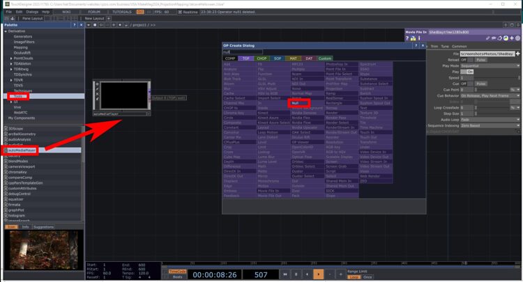
For Halloween we’re assuming you might want to change the content in each slice throughout the show, so we’re adding an AutoMediaPlayer and Null to the network workspace for each slice. Add the first AutoMediaPlayer from Tools → AutoMediaPlayer to the network workspace, then right-click on the purple Output node to bring up a dialog box and select Null (Figure L).

Figure L

Once you have this pair, select them by right clicking and dragging an area that includes them both, then copy them by Crtl-C (or Cmd-C on a Mac) and paste as many times as you have slices by Ctrl-V (or Cmd-V on a Mac). Rename each Null to the name of the slice that the content will be for. Reopen the Kantan Mapper window by clicking on it in the network workspace, then drag it to the side so you can see all your slice names. Toggle the Kantan window back on and select each slice and drag the named Null for each slice to that slice (Figure M).

Figure M

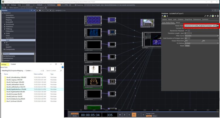
Now select each slice’s Auto Media Player and assign the folder for the content (Figure N). Go through the fields below this and Randomize Playback if desired, set Transition Time, Hold Duration, Fit Method, and the Output Resolution. Aren’t you glad we put that in the folder name now?

Figure N

Your show should now start to take shape! Open the Kantan window and/or output to your projector to see how it all looks. You will probably want to go back and tweak the content now that you can see it all playing together.

You might even want to add some new slices as you work on your overall composition. For example, we thought a rustic wooden frame would look good around our old movie insert, so we made an extra slice for that.

7. Test and tweak in situ

Set up your projector where you get full coverage, ideally centered on the building. It’s OK if you have to be off to the side a bit — the middle of your driveway probably isn’t the safest place. If your projector is set to blue when there is no signal, use that to work out where you should set up your table. You’re aiming to get full coverage without too much wasted light spill.

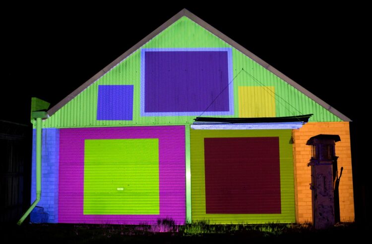
Cable your projector into your laptop and boot up your project in TouchDesigner. Toggle your Output on in your Kantan Mapper window. It’s likely that your slices will all be way off, as you’re probably not in the exact same spot where you took the photo, and it’s likely your camera lens has a different focal length than your projector lens. It’s fine though! Even ours started out wonky (Figure O).

Figure O

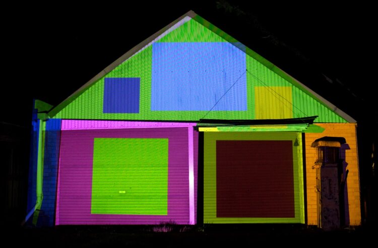
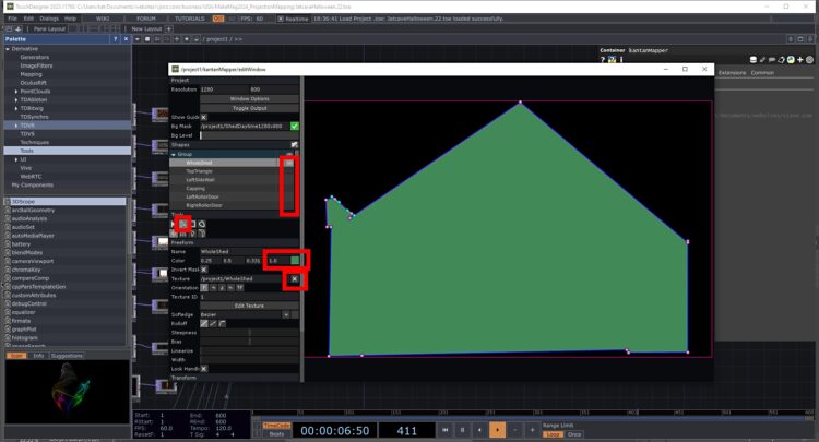
Line up the slices one at a time. Turn off the visibility for all the other slices, and uncheck the content Texture field so you get the solid color for the slice showing. Then choose the Select Keys and Handlers tool and move each point of the selected slice around until it’s in the right spot on the building (Figure P).

Figure P

Continue slice by slice until you have all your slices in the right place on your building (Figure Q).

Figure Q

You can change the layer order by dragging them in the Kantan window list (Figure R). Remember, the lower in the list, the further in front of the other layers (which is the opposite of many other programs).

Figure R

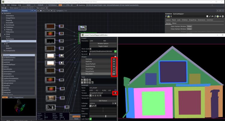
Now your slices are all in place! Check the content Texture for all the slices (Figure S), and turn off the eye for any slices you don’t want visible.

Figure S

No matter how long you’ve put into getting your content just how you like, there’s no substitute for testing in situ (Figure T). You may have to edit your content to make it fit the slice better without looking stretched. Experiment with different Fit methods in the slice if your content isn’t all appropriately sized or leaves gaps showing. Fit Best, or Fill, are usually good options to start with.

Figure T

Finally, if there’s anything unsightly or reflective in front of any of your slices, you can add more slices and fill them with black.

Conclusion

Fantastic Phantasms

Now you’re ready for your Halloween projection show! And there are so many things you can do in TouchDesigner in addition to this basic mapping. For example, you could have your content be audio reactive, or change colors over time. You can adjust the levels of any particular slice to account for a darker surface. You could flip the content back and forth, or rotate it slowly. You can procedurally generate patterns using noise, or add interactivity.

There are many TouchDesigner tutorials online, and it’s very adaptable and stable software — even if the interface isn’t as user-friendly as more commercial alternatives. The Interactive & Immersive HQ does great TD tutorials, including a free Beginner Crash Course on their YouTube channel.

This project appeared in Make: Volume 90. All photos by VJzoo. Illustrations by Midjourney. Films from Archive.org