Plotly provides a free platform for makers to stream data to the cloud, where they can graph and analyze their data, discover other makers, and share and comment on these data streams. The data is always owned by you, the maker, so you can download, share, or remove it as you like. Many of the ideas for Plotly (and much of the code) were conceived a few miles from MAKE headquarters, in a cottage in Sebastopol, Calif. Plotly is now a team of eight in Montreal, San Francisco, and Boston, building a platform to connect makers and data scientists through a global data streaming network.
Wi-fi shields for Arduinos and Rasberry Pi have come down in price, and new hardware platforms like the Tessel are being designed with internet connectivity built-in. Soon, all of our devices and projects are going to be internet-connected. There should be an easy and free place to deposit, share, and analyze the data coming from them — and that’s where Plotly comes in.
“Plotly users can collaborate on projects at any scale — from a two-person laboratory to an international, crowd-sourced, data bonanza.”
Plotly keeps track of the data from all of our projects and devices in the cloud, where it can be analyzed, discovered, and re-shared collaboratively. Owners of this data can then connect to other Plotly users by location and similar interests. Since the data, graphs, and code is all in one place, Plotly users can easily build on each other’s work, help each other understand their data, and collaborate on projects at any scale — from a two-person laboratory to an international, crowd-sourced, data bonanza.
Here are some of our favorite projects makers and data scientists are connecting to Plotly.
Arduino Environmental Data
Alex Vados and Matte Vonnée use Plotly to measure the temperature and humidity of their Montreal-based studio, where they build wood-encased MIDI controllers under the moniker Les Instruments. They made a beautiful Instructable about this project that you can enjoy here. Clicking the graph below will take you to a live Plotly view of their data stream. You can see more projects and graphs by Alex and Matte at Alex’s Plotly profile.


Rasberry Pi and Nest Thermostat Data
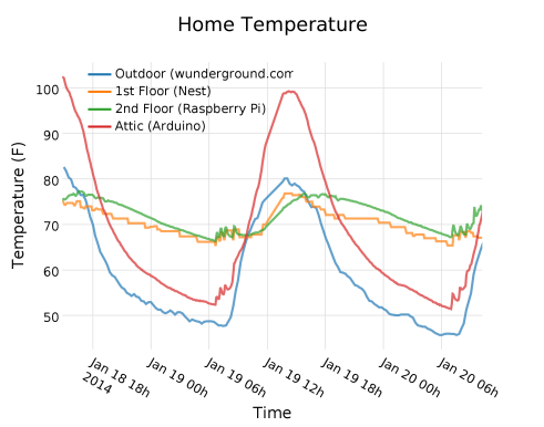
Across the continent, in Southern California, Farhan Simjee is streaming temperature data from different locations in his house to Plotly using a Nest thermostat (1st floor), Raspberry Pi (2nd floor), and Arduino (attic). You can see in the Plotly graph below that the Arduino in his attic measures a higher temperature than the Nest thermostat on his first floor. Farhan has more details about this project on his GitHub.


Streaming Data from Space: Plotly for NASA Satellite Research
Professor Carl Brandon at Vermont Technical College uses Plotly to graph and share data from the satellites he launches for NASA. The satellites stream data to his computer, then he uploads the files to Plotly to graph and share the data. Below is a photo of the satellite with a Plotly graph of its angular position in space over time.
Carl has more fantastic graphs from this satellite on his profile page, including how much solar energy it produces and how far above the Earth it is.


Graphs for Online Journalism
You don’t have to be building or measuring something to use Plotly. Rhett Allain at Wired magazine uses Plotly to make graphs on his blog “Dot Physics.” Below is his graph of sound waves from his article “How Do You Levitate Things with Sound?”
To see more graphs from Rhett’s articles, check out his Plotly profile.

Plotly’s mission is to connect makers, data scientists, researchers, and journalists through the data of their projects and research, while providing free, online tools that facilitate better understanding and discoverability of this data. If you’re excited about what we’re doing, or want to share your projects, drop us a line at jack [at] plot [dot] ly, or on Twitter @plotlygraphs. We’re a very young company and want to build this right, so we’d love to hear your ideas and feedback!
+Also, check out Plotly’s latest video, showcasing a project that uses Plotly to stream and visualize remote temperature and humidity data:
ADVERTISEMENT


